
20 New And Fresh HTML5 Mobile Slideshow Scripts
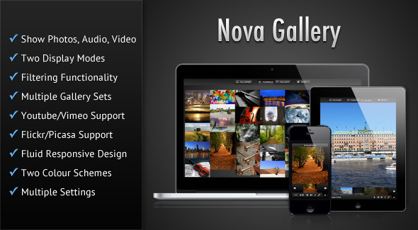
Nova Gallery is a HTML5 multimedia gallery enabling you to showcase your photos/audio/video in a beautiful and sleek interface. The gallery features a fluid responsive design and can fit in any screen size ranging from jQuery mobile slideshow to desktop browsers. The gallery also features touch-screen support and uses hardware accelerated CSS based animations wherever possible which results in smooth animations, that is especially noticeable in mobile devices. Also check out the demos in your mobile devices such as iPad/iPhone or Android devices. You can also have a slideshow of the items in the Full-width mode. This slideshow stops whenever the browser tab in which the gallery is displayed, goes out of focus (this feature only works in browsers that supports the HTML5 Page Visibility Api). Plays audio and video natively in modern HTML5 browsers and switches over to Flash/Silverlight for older browsers by using Mediaelement. True HTML5 Fullscreen option in supported browsers. The gallery features a fluid responsive design to account for various screens sizes ranging from simple mobile phones to desktop browsers and can also be placed in a container of any width. The gallery is mobile device friendly with touch screen support. Hardware accelerated CSS animations have been used wherever possible resulting in smooth animations, which is most noticeable in mobile devices. You can start the slideshow in Full-width mode when the gallery first loads. The time interval for which a particular item is visible during slideshow can be set. Option to detect mobile devices and serve them a separate XML file. Also some of the modern HTML5 features such as Fullscreen and Page Visibility will only work in modern browsers.
2. WOW Slider
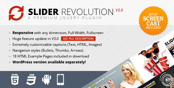
The most strong and popular web design trend over last couple of years is a sliding horizontal panels also known as Sliders or Carousels. Image slider is a very effective method to increase the web site usability and engage the user.
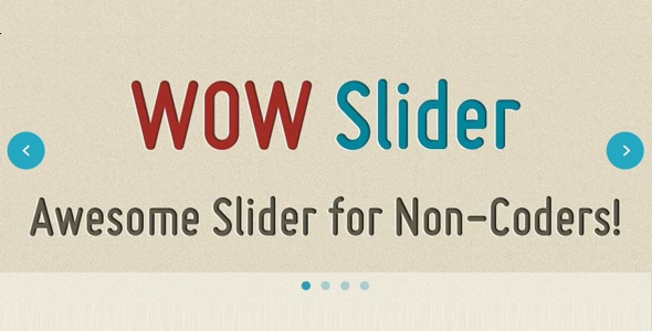
WOW Slider is a responsive jQuery image slider with amazing visual effects and tons of professionally made templates. NO Coding - WOW Slider is packed with a point-and-click wizard to create fantastic sliders in a matter of seconds without coding and image editing. Wordpress slider plugin and Joomla slider module are available.
Also, you can share your slider on Facebook.
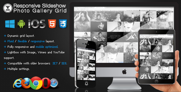
The Responsive Slideshow Photo Gallery has a fluid / flexible / responsive layout. The Responsive Slideshow Photo Gallery is using the GPU (hardware acceleration) using HTML5 standards. The rendering speed and performance is impeccable on desktop computers and most importantly on mobile devices, the way it works it will try to use CSS3 and if this is not available it will down fall to CSS2 or CSS1 for older browsers like IE7 and IE8. Great performance on mobile devices, you can see in the video demo that it runs just like a native app!, it was coded and optimized for mobile devices and it is 100% mobile compatible and of course it will run just as great on desktop computers including on older browsers like IE7 and IE8. Slideshow button (optional). Slideshow delay, the delay of the slideshow can be set in seconds. Slideshow autoplay. Slideshow custom animated graphics.2013 – Fixed some bugs related to the lightbox and added better support for mobile detection.
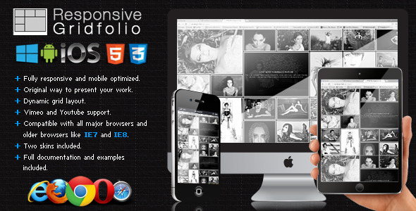
Added support for MSPointer events for windows8 mobile. The Responsive Gridfolio is using the GPU (hardware acceleration) using HTML5 standards. The rendering speed and performance is impeccable on desktop computers and most importantly on mobile devices, the way it works it will try to use CSS3 and if this is not available it will down fall to CSS2 or CSS1 for older browsers like IE7 and IE8. Great performance on mobile devices, you can see in the video demo that it runs just like a native app!, it was coded and optimized for mobile devices and it is 100% mobile compatible and of course it will run just as great on desktop computers including on older browsers like IE7 and IE8. Slideshow button (optional). Slideshow delay, the delay of the slideshow can be set in seconds. Slideshow autoplay. Slideshow custom animated graphics.2013 – Bug fix related to the lightbox when it is zoomed on Chrome and better detection for mobile devices.
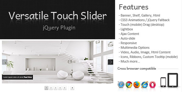
Has the touch feature to mobile and drag for the desktop. Touch (mobile) and Drag (desktop);
Video and Audio with HTML5 support. Icons, Ribbons, Custom Tooltip (mobile);
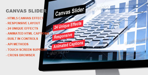
touch support for mobile devices.This slider includes a smooth animation effect created using HTML5 Canvas which is completely configurable
and mobile platforms like iphone / ipad.
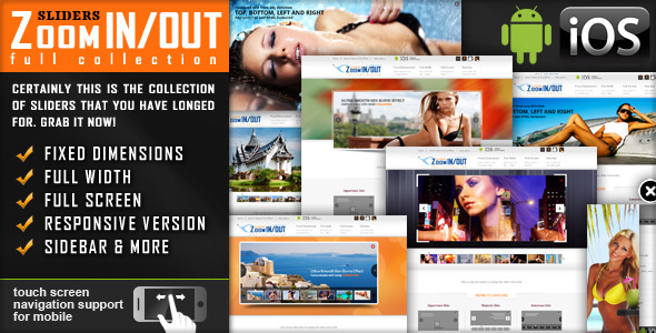
touch screen navigation support for mobile
supports YouTube, Vimeo, HTML5 or other video player
banner rotator, caption, fluid, gallery, image, jquery, mobile, ios, plugin, resizable, responsive, slider, slideshow, swipe, touch
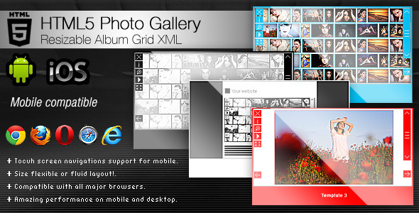
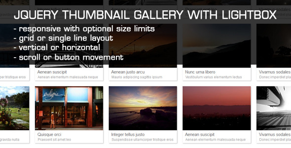
The jQuery gallery photo – Resizable Album Grid XML is size flexible or fluid, it will adapt it’s size (width and height) based on the parent container (div or some other html tag) and every piece of the gallery will align and position accordingly, this basically mean that it can be used in any kind of website, it dose not matter if you need a small or large gallery, all you have to do is to add the gallery in a place which you have chosen in your website and the gallery will adapt. Amazing performance for mobile using css3, you can see in the video demo that it runs just like a native app!, it was coded and optimized for mobile devices and it is 100% mobile compatible and of course it will run just as great on PC. - Keyboard support you can navigate between the large images with the right and left key and start or stop the slideshow with the space key.
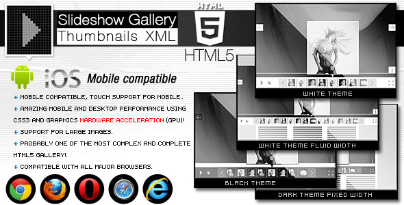
What is create HTML5 slideshow Gallery Thumbnails XML?
The HTML5 slideshow example Gallery Thumbnails XML is size flexible or fluid, it will adapt it’s size (width and height) based on the parent container (div or some other html tag) and every piece of the gallery will align and position accordingly, this basically mean that it can be used in any kind of website, it dose not matter if you need a small or large gallery, all you have to do is to add the gallery in a place which you have chosen in your website and the gallery will adapt. This gallery is using the GPU (hardware acceleration), the rendering speed and performance is impeccable on desktop computers and most importantly on mobile devices. The HTML5 slideshow template Gallery Thumbnails XML comes in with 3 different embed styles: Fixed Dimensions, Full Width and Full Screen. Amazing performance on mobile devices, you can see in the video demo that it runs just like a native app!, it was coded and optimized for mobile devices and it is 100% mobile compatible and of course it will run just as great on PC. This HTML5 photo slideshow Gallery Thumbnails XML plugin can be embedded in WordPress and you will receive, along with the download files, the complete instructions in the help file. Optimized for mobile, you can actually drag and swipe the images just like you would on a native mobile app (touch screen navigation support for mobile), we insist to watch again a video demo at this link
Zoom in and zoom out buttons (maximize / minimize) for the big images this buttons allow to maximize the image and pann it with the mouse on desktop and finger on mobile, this feature can be really useful! (optional). Keyboard support you can navigate between the large images or thumbs with the right and left key for the large images and up and down key for the thumbs and start or stop the slideshow with the space key.The image description/info window is also flexible / fluid, this mean that it will resize to always fit the screen, it dose not matter what device is used or the screen resolution, the text will always be visible, if there is too much text on pc a scrollbar will appear and on mobile the text can be scrolled with the finger.
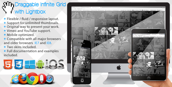
The Infinite Photo Grid with Lightbox is using the GPU (hardware acceleration) using HTML5 standards. The rendering speed and performance are impeccable on desktop computers and most importantly on mobile devices. Great performance on mobile devices, you can see in the video demo that it runs just like a native app!, It was coded and optimized for mobile devices and it is 100% mobile compatible and of course it will run just as great on desktop computers including on older browsers like IE7 and IE8. Slideshow button (optional). Slideshow delay, the delay of the slideshow can be set in seconds. Slideshow autoplay. Slideshow custom animated graphics.
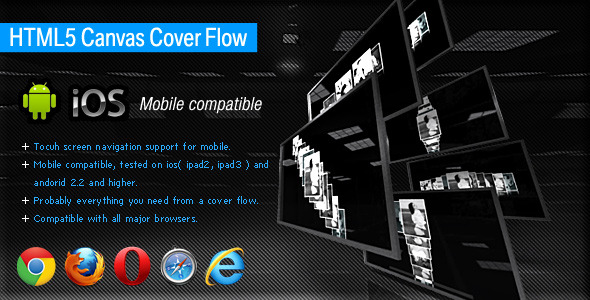
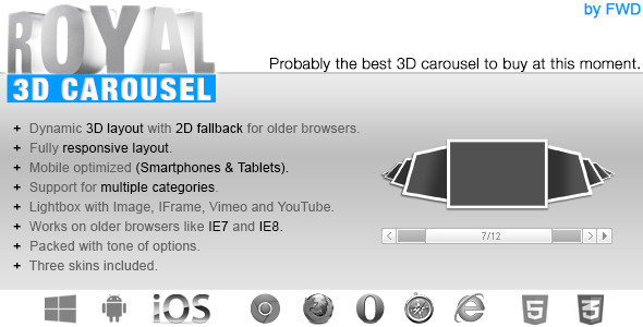
This is an amazing HTML5 Canvas XML Cover Flow presenting a 3D photo gallery with tons of features. This very complex HTML5 Canvas 3D Cover Flowis is optimized for mobile devices (Android and IOS mobile devices such as iPad2, iPad3, iPhone, Samsung Galaxy Tab etc). This HTML5 Canvas Cover Flow can have any image presented in any way you want: horizontal, vertical, oblique, also it has unique presets with pre-defined movements and presentations. mobile optimized.the buttons, scrollbar and slideshow preloader positions can be set to be anywhere.set the slideshow transition time (when set to autoplay).
net/3d-html5-slider/
3 fallback levels considered, CSS3 3D Transforms, HTML5 Canvas element, 2D Mode. Option to set shuffle mode for slideshow
Add new feature: Shuffle mode for slideshow
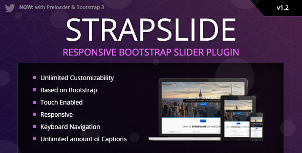
Turn simple HTML markup into a responsive(mobile friendly) or fullwidth slider with must-see-effects and meanwhile keep or build your SEO optimization (all content always readable for search engines).Vimeo & Youtube and HTML5 video autoplay Supported
Estancia Responsive HTML5 Theme (ignitethemes)
Reverance Responsive HTML5 Church Theme (ignitethemes)
Added: Examples like LazyLoad, Aligns, Fullscreen, Fullscreen-with-offsets, html5,vimeo and jQuery slideshow youtube
Feature: HTML5 Video (videoJS) and added data- options like
option added to laod the HTML5 js files via videoJsPath:”rs-plugin/videojs/”
Helps in Mobile views
Helps in Mobile views.
Check this on your mobile phone (tested on IOS and Android):
Toggle inner slideshow number (start/stop)
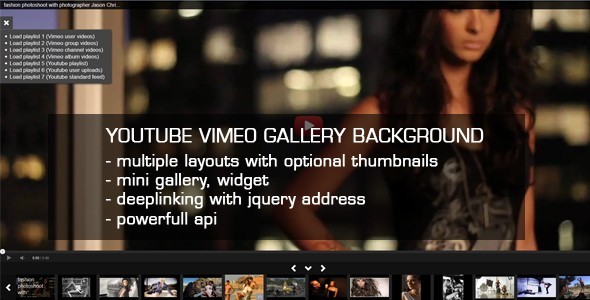
Responsive Video Gallery HTML5 Youtube Vimeo
HTML5 Video Gallery with Live Playlist
JQuery AutoSlide Image Gallery Slideshow with Music
HTML5 Audio Player With Playlist
JQuery Stack Banner Slideshow with Captions
Even more important, it is fully responsive and mobile optimized and can take on any dimensions.HTML5 Support to play self hosted videos
Slideshow Design
Enhanced mobile experience
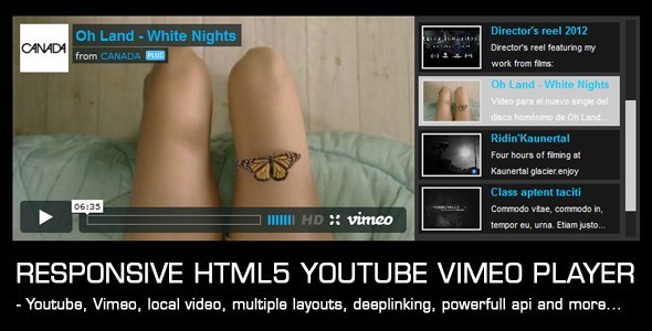
Player supports HTML5 and flash video player download backup, Youtube and Vimeo with multiple layout configurations. Check this on your mobile phone:
Supports HTML5 and jQuery video gallery backup, Youtube and Vimeo
HTML5 Video & Image Background Intro
JQuery Ken Burns Fullscreen Gallery Slideshow
HTML5 Video Gallery with Live Playlist
JQuery AutoSlide Image Gallery Slideshow with Music
JQuery Image Gallery Slideshow with MousePan
HTML5 Audio Player With Playlist
jQuery Accordion MultiPurpose Gallery Slideshow
JQuery Stack Banner Slideshow with Captions
jQuery Slice Banner Slideshow with Captions
Also, it’s iPhone / iPad compatible and optimized, it looks great on mobile and tablets.HTML5 technology - this gallery uses the latest html5 tehniques to deliver a never seen before experience to your clients
slideshow mode – display images in a slideshow
responsive – looks great from mobile to HD
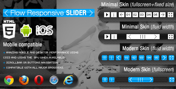
The HTML5 Flow Responsive Slider has a flexible / fluid / responsive layout, it will adapt it’s size (width and height) based on the parent container (div or some other html tag) and every piece of the gallery will align and position accordingly, this basically mean that it can be used in any kind of website, it dose not matter if you need a small or large gallery, all you have to do is to add the gallery in a place which you have chosen in your website and the gallery will adapt. This gallery is using the GPU (hardware acceleration), the rendering speed and performance is impeccable on desktop computers and most importantly on mobile devices. The HTML5 Flow Responsive Slider comes in with four different embed styles: Fixed Dimensions, Full Width, Full Screen and Flexible Style, please not that the flexible style will make the slider adapt the width and height based on the html element into which is embedded so for example if you want to add the slider in a div and that div has a 100% height the slider will adapt based on that, this is a unique and amazing feature. Amazing performance on mobile devices, you can see in the video demo that it runs just like a native app!, it was coded and optimized for mobile devices and it is 100% mobile compatible and of course it will run just as great on PC. This HTML5 Flow Responsive Slider plugin can be embedded in WordPress and you will receive, along with the download files, the complete instructions in the help file. Optimized for mobile, you can actually drag and swipe the images just like you would on a native mobile app (touch screen navigation support for mobile), we insist to watch again a video demo at this link
Slideshow preloader bar, the color and opacity for this bar can be modified. Keyboard support you can navigate between images with the right and left keys and start or stop the slideshow with the space key.
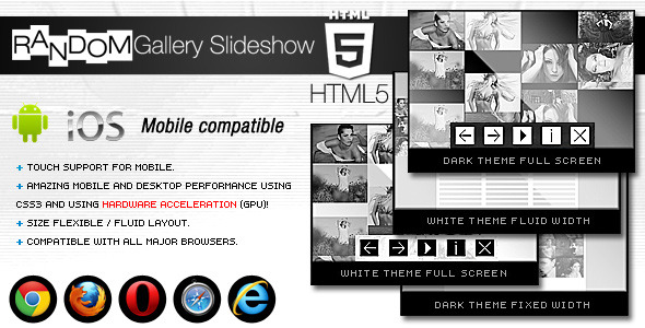
The HTML5 Random Gallery Slideshow is size flexible or fluid, it will adapt it’s size (width and height) based on the parent container (div or some other html tag) and every piece of the gallery will align and position accordingly, this basically mean that it can be used in any kind of website, it dose not matter if you need a small or large gallery, all you have to do is to add the gallery in a place which you have chosen in your website and the gallery will adapt. This gallery is using the GPU (hardware acceleration), the rendering speed and performance is impeccable on desktop computers and most importantly on mobile devices. The HTML5 Random Gallery Slideshow comes in with 3 different embed styles: Fixed Dimensions, Full Width and Full Screen. Amazing performance on mobile devices, you can see in the video demo that it runs just like a native app!, it was coded and optimized for mobile devices and it is 100% mobile compatible and of course it will run just as great on PC. This HTML5 Random Gallery Slideshow plugin can be embedded in WordPress and you will receive, along with the download files, the complete instructions in the help file. Optimized for mobile, you can actually drag and swipe the images just like you would on a native mobile app (touch screen navigation support for mobile), we insist to watch again a video demo at this link. Keyboard support you can navigate between the large images or thumbs with the right and left key for the large images and up and down key for the thumbs and start or stop the slideshow with the space key. The image description/info window is also flexible / fluid, this mean that it will resize to always fit the screen, it dose not matter what device is used or the screen resolution, the text will always be visible, if there is too much text on pc a scrollbar will appear and on mobile the text can be scrolled with the finger.
Check this on your mobile phone:
Responsive Video Gallery HTML5 Youtube Vimeo
HTML5 Video Gallery with Live Playlist
JQuery AutoSlide Image Gallery Slideshow with Music
HTML5 Audio Player With Playlist
JQuery Stack Banner Slideshow with Captions